Internet Brands Design System Creation
Timeline
August 2021 - January 2022
Summary
Internet Brands lacked a design system. Despite being on a strict timeline, the design team successfully researched and built the very first Design System from the ground up. This new system will eventually be used by all designers across the company in all verticals.
My Role
During the creation process, I led the research and auditing phases and ensured that the system is accessible and inclusive.
What I did
- Studied and analyzed dozens of other companies' design systems
- Audited the current Demandforce product and existing UI Kit to identify necessary components for the new design system
- Collaborated with the Marketing team in order to identify the Demandforce Brand Identity
- Completed several design team studio sessions in order to create our Design System Philosophy
- Built and tested various components in Figma, while also incorporating auto-layout and other features
- Successfully presented new screens reskinned with the IB Design System to 170+ individuals at the product showcase in January 2022, formally introducing the new design system to the whole DF team for the first time
The Problem: "How do we build a complete and inclusive Design System from scratch on a short timeline."
The Business Problem
Building new products and ensuring the IB product suite all look and perform similarly have been major problems. Although designs were functional, many products were inconsistent and lacked certain components.
From a Designer's Perspective
The use of an incomplete UI Kit proved to be a tedious process to piece together designs. I spent many hours locating documentation for components and working with other designers to achieve uniformity.
My Design Thinking
I collaborated with the design team to combat our current problems while also creating a foundation for future designers.
Creating a design system comes with many challenges, but having a flexible plan from the beginning helps keep everything moving in the right direction. It's important that researching, auditing, and identifying the design system identity are done properly in order to lay a proper foundation for all the component building.
01 Where We Started
Researching Design Systems
Assessing The Technical Feasibility and Limitations
Identifying our Brand Identity
Considering Product Strategy
Accessibility for All
Demandforce-first Approach
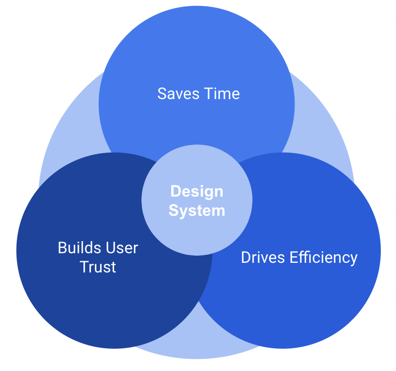
We started by defining "design system guidelines" as a toolkit that promotes consistent user experiences across features and platforms. Before creating a design system for IB, we began with our largest product, Demandforce, which accounts for about 85% of the total revenue generation.
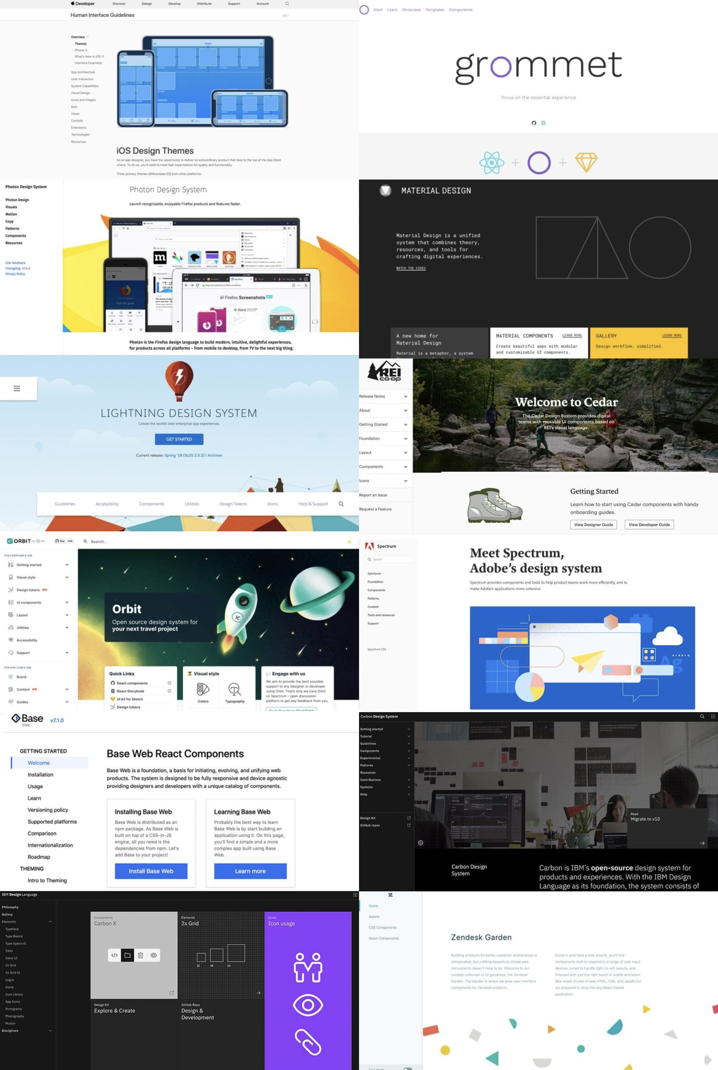
I spent 75+ hours breaking down and studying other companies' design systems, guidelines, and creation processes to understand the necessary features and building blocks. I combined this knowledge with the best UX practices when building systems from scratch.

After speaking with the IB Marketing team in charge of brands like WebMD and Demandforce and syncing with the lead developer, I incorporated all necessary teams to develop an inclusive design system. Ensuring alignment and getting buy-in were vital to our success, as all components will eventually be used across all verticals under IB.
02 Auditing the current UI Kit
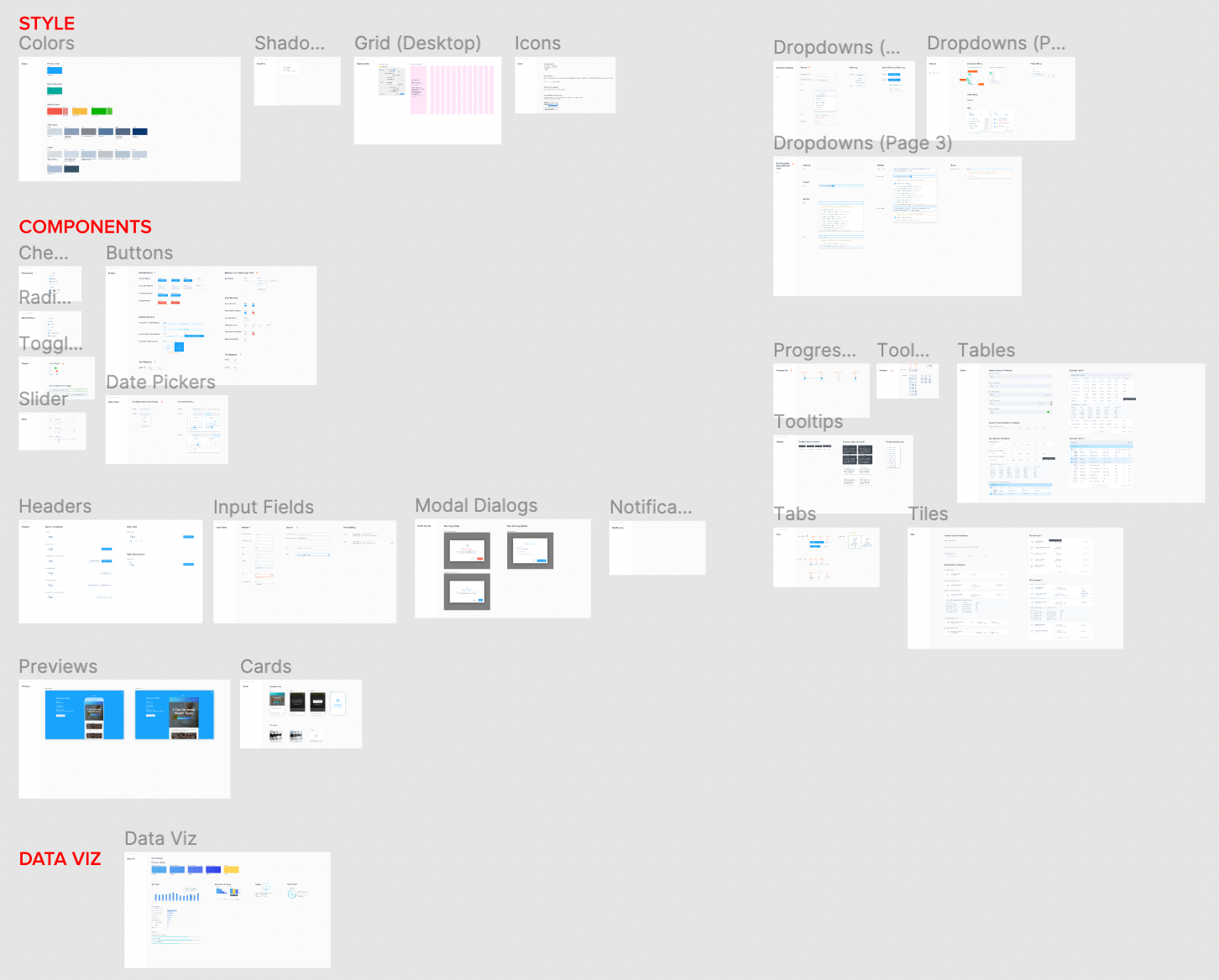
The previous UI Kit was disorganized, inaccessible, and lacked many necessary components. A crucial problem was that each component lacked proper documentation, making it extremely difficult for new designers to distinguish how and where to use them. Our goal was to address all these issues and make important additions in order to create a proper and complete design system.
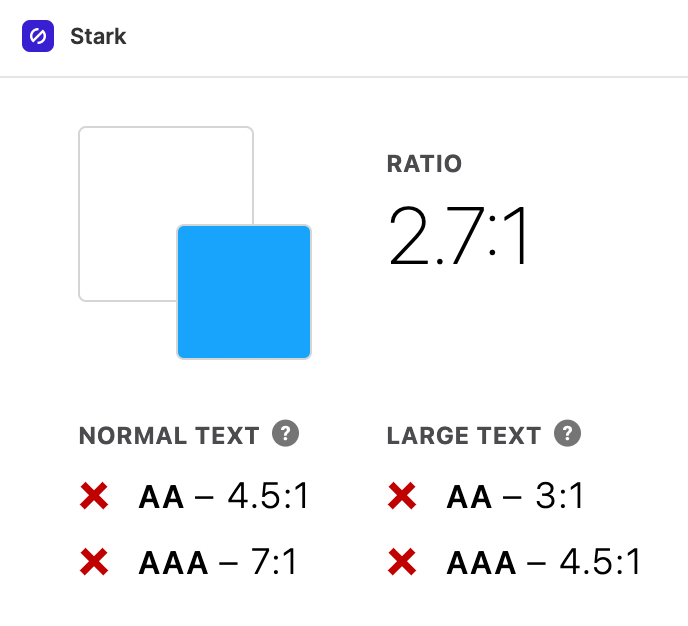
One critical problem that affected our whole design system and each component was that our previous primary blue did not meet the required accessibility guidelines. This was something that we had to take into account and consider when moving forward. I advocated for inclusive design and made sure that we met WCAG 2.1 guidelines.
03 Brand Characteristics and Design Principles
The Demandforce Brand Identity: Studio Process
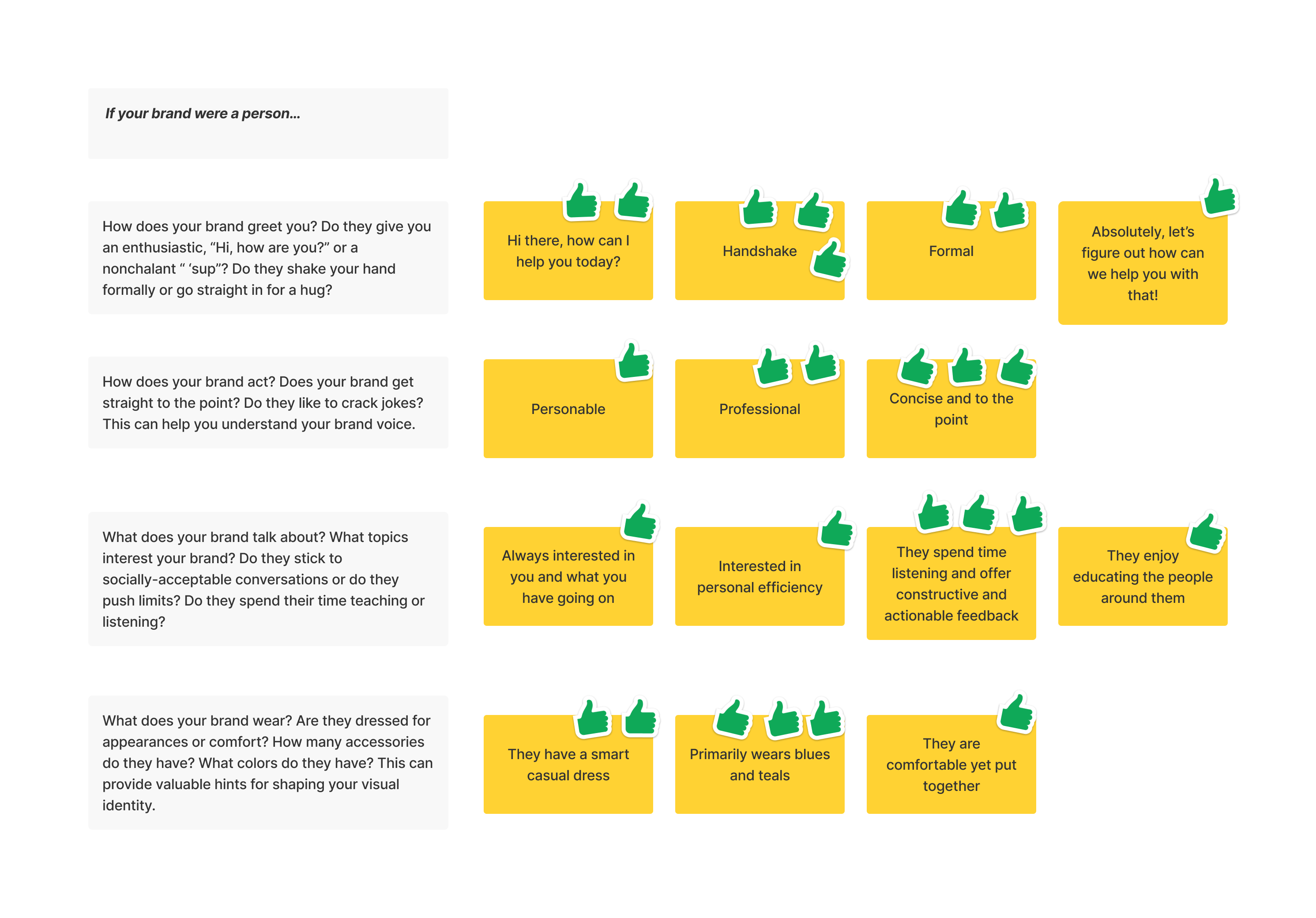
This is a sneak peek into one of the many studio processes that our design team of four used. Brand Identity is so important and directly contributes to brand loyalty and familiarity. By properly identifying these characteristics, we are able to "dress up" and build our products in a uniform way in order to build trust with our customers.
Demandforce Brand Characteristics
Formal yet Friendly
Direct yet Approachable
Attentive yet Inclusive
Smart yet Casual
Developing our Design Principles
We aimed to make our design principles truly representative of what design means to the Product Team and Internet Brands as a whole. It was important that we made our principles specific, nuanced, and actionable. We thought about how we wanted to approach design and had to ask ourselves, "What are you trying to achieve with the system?"

After weeks of synthesizing our identity and aligning our design direction with goals, we chose three design pillars and two sub-pillars for each.
Our designs are Efficient
We ensure that every atom, molecule, and organism is created with a purpose in a way that is scalable and able to contribute to the growth and viability of our designs. Leaving complexity at the door and focusing on providing all the necessary information in a smart and elegant way allow us to be clear and concise for our users.
Our designs are Harmonious
We aim to create a holistic and cohesive system by drawing from a foundation of systematic predictability. Through this, we will form beautiful designs that allow users to feel a sense of comfort, trust, satisfaction, and see the value in their product experience.
Our designs are Inclusive
We work to identify user needs, make users feel understood, and build intuitive solutions with the desire to help individuals accomplish their goals.
04 The Foundation of Demandforce (and soon to be Internet Brands) Design
Atomic Design
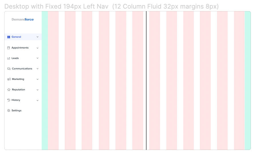
After taking inventory of all the necessary components, we used Atomic Design methodology to build our new design system from scratch. I advocated for an 8px grid to build on all our designs. We developed a timeline with specific phases to release components of varying priorities.
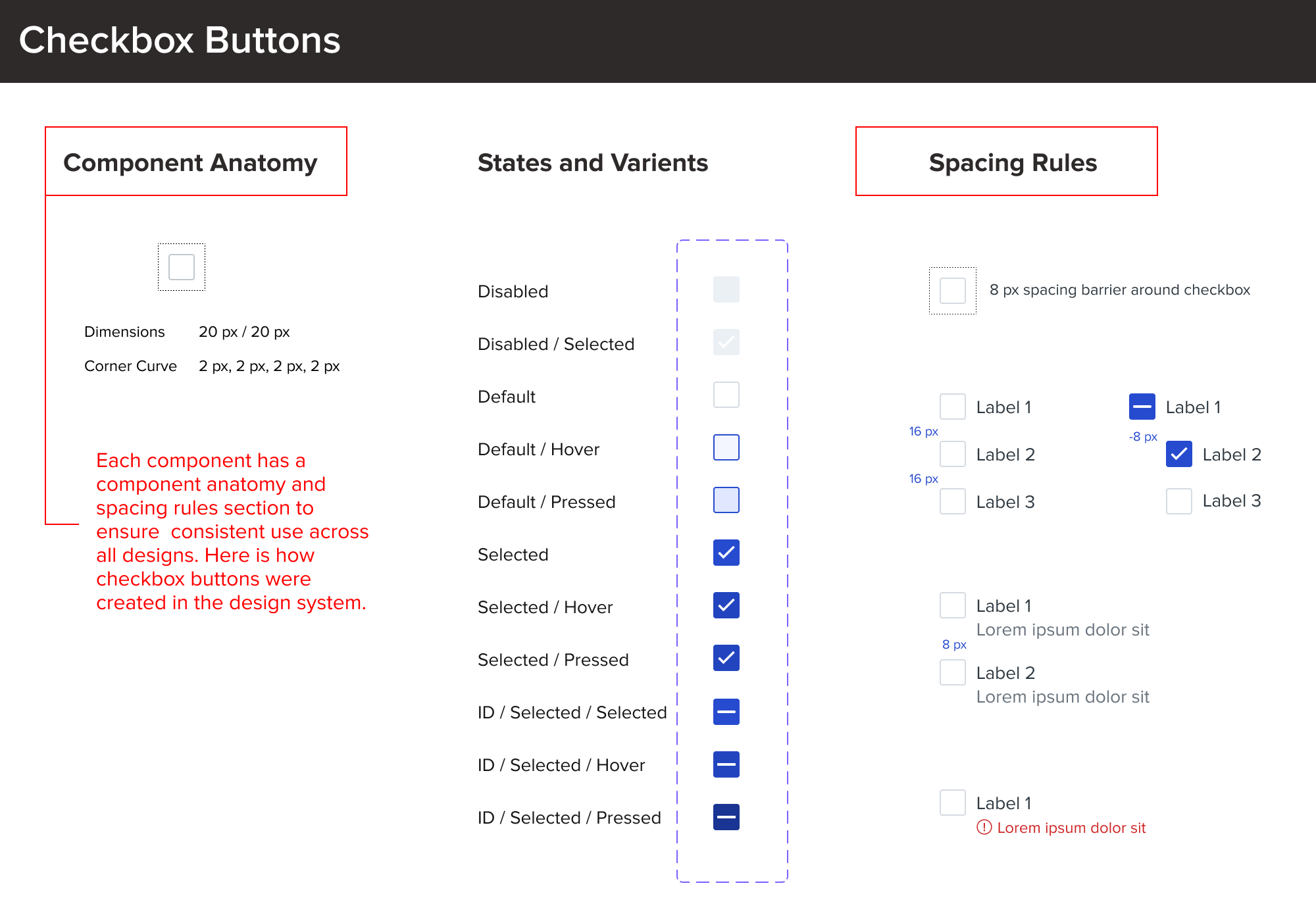
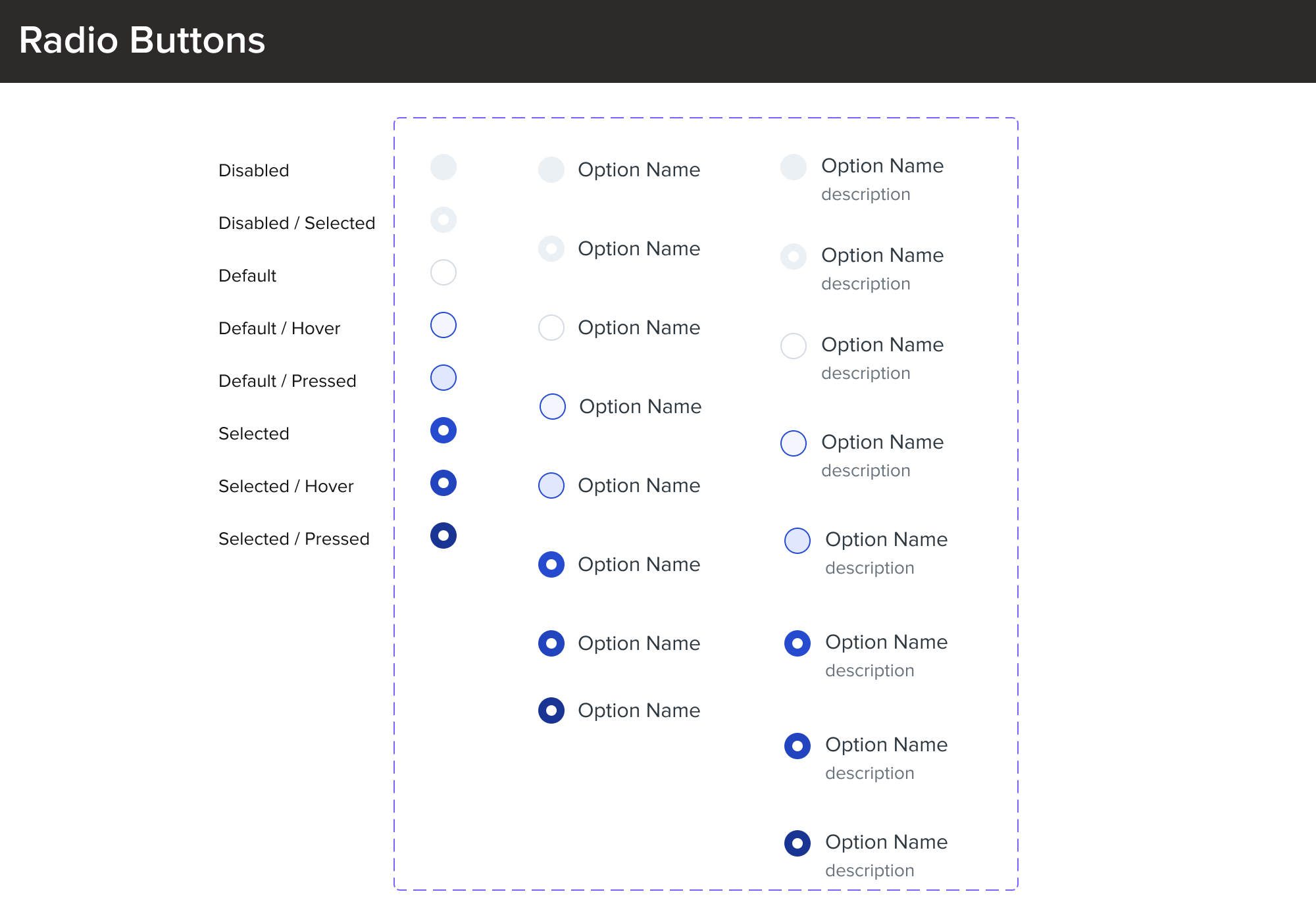
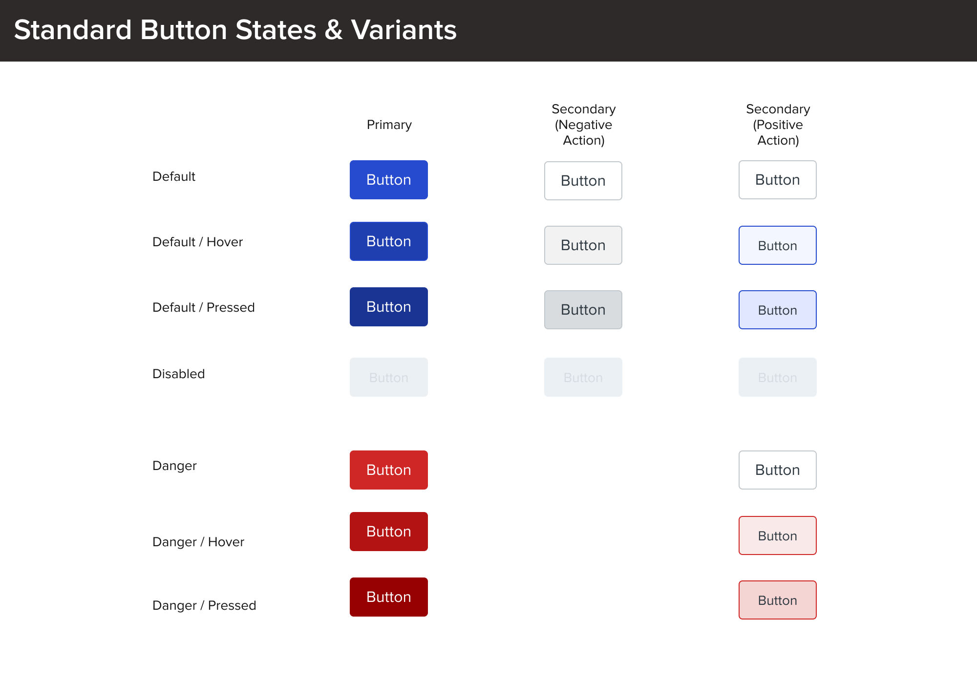
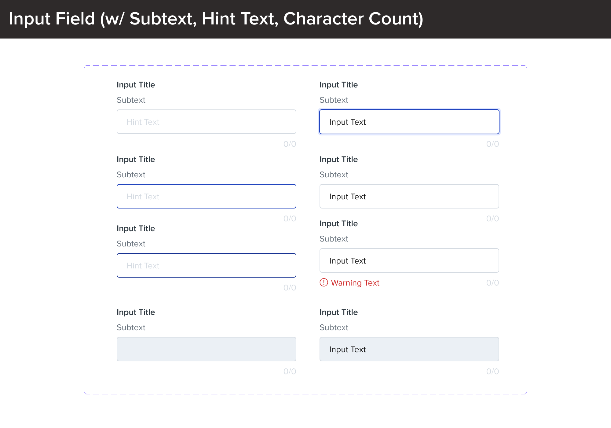
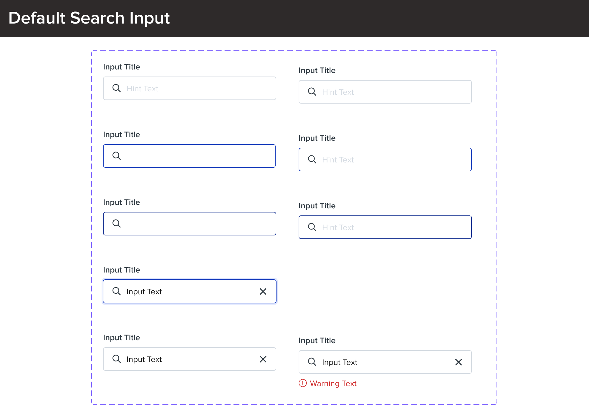
Phase 1: checkboxes, radio buttons, standard buttons, anchor buttons, input field states, etc.
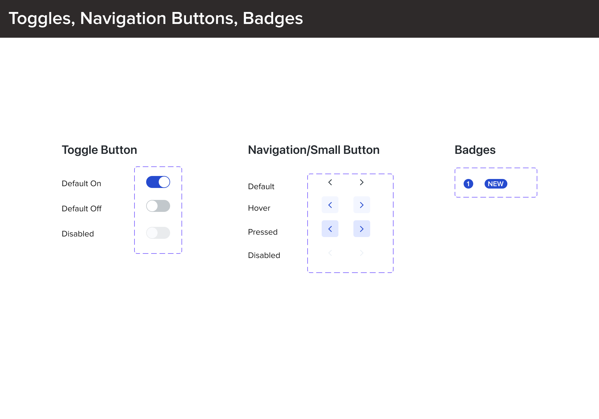
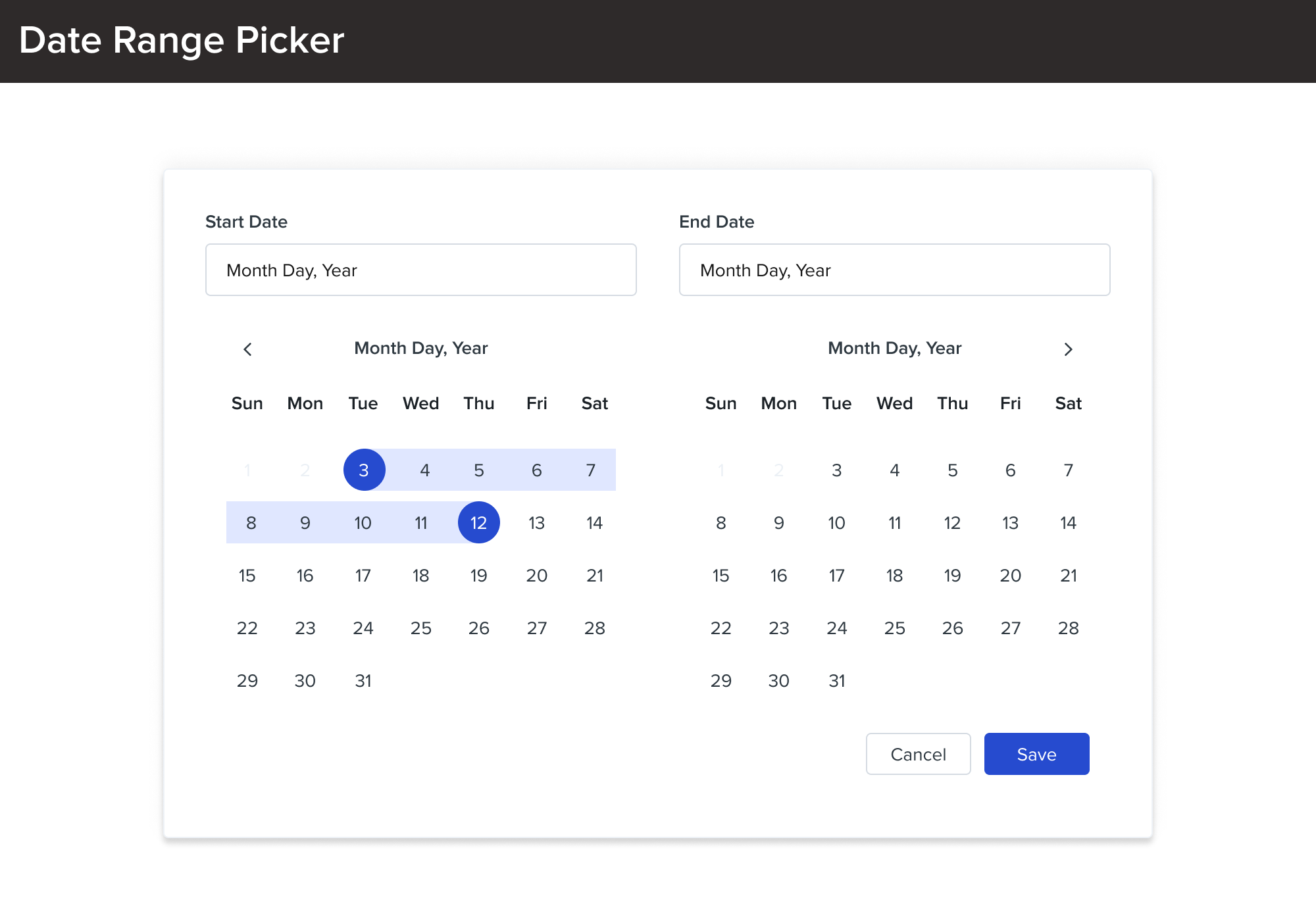
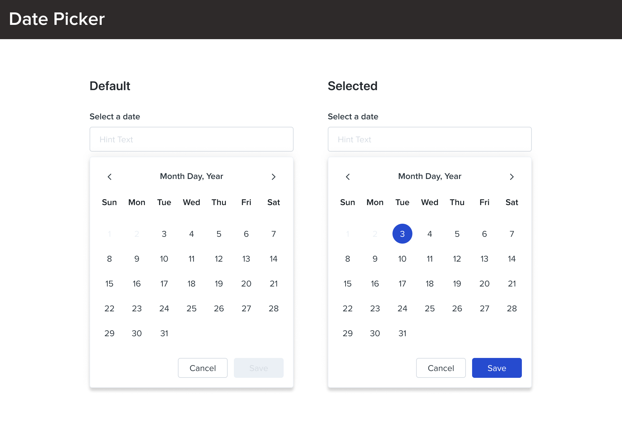
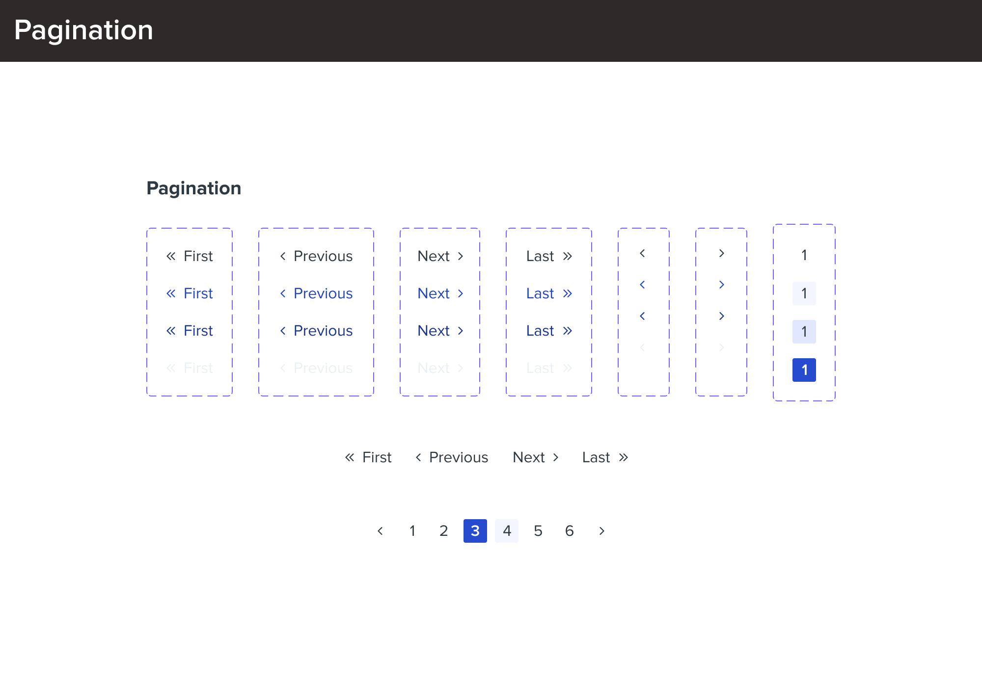
Phase 2: split buttons, placeholder buttons, toggle buttons, dropdown menus, pre-populated dropdowns, tabs, date pickers, calendar pickers, progress bars, pagination, etc.
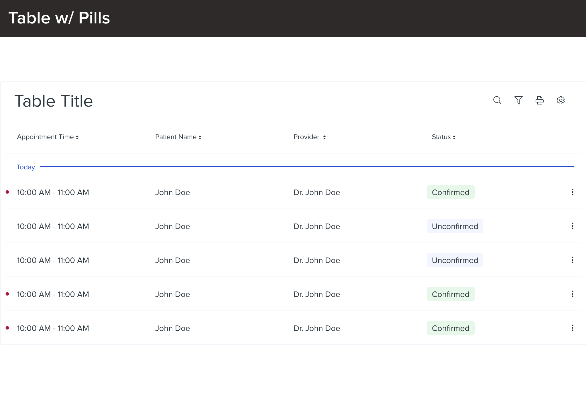
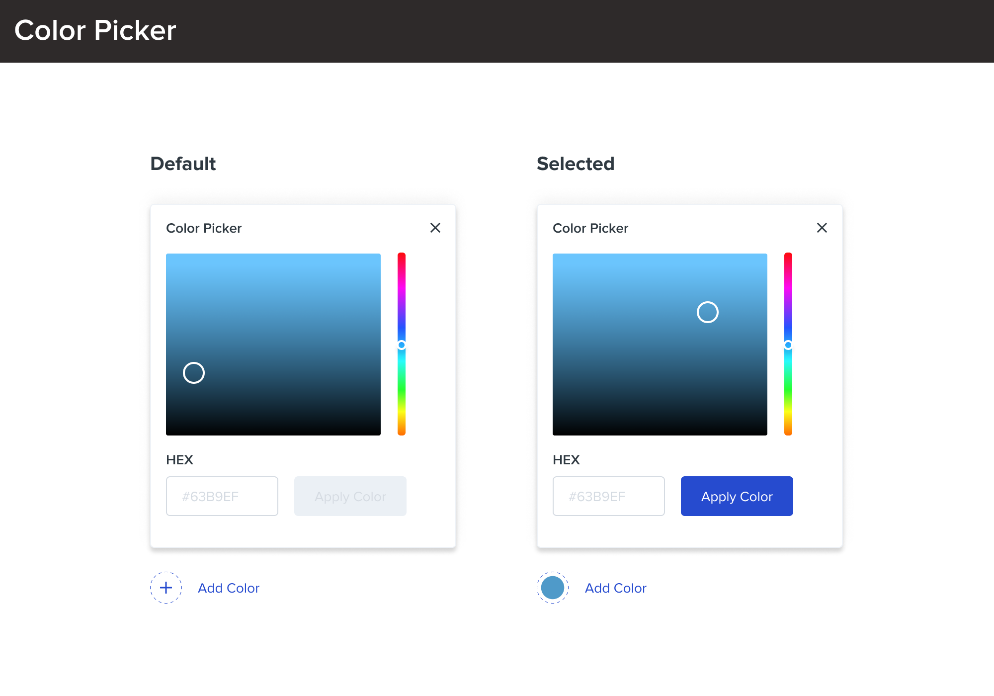
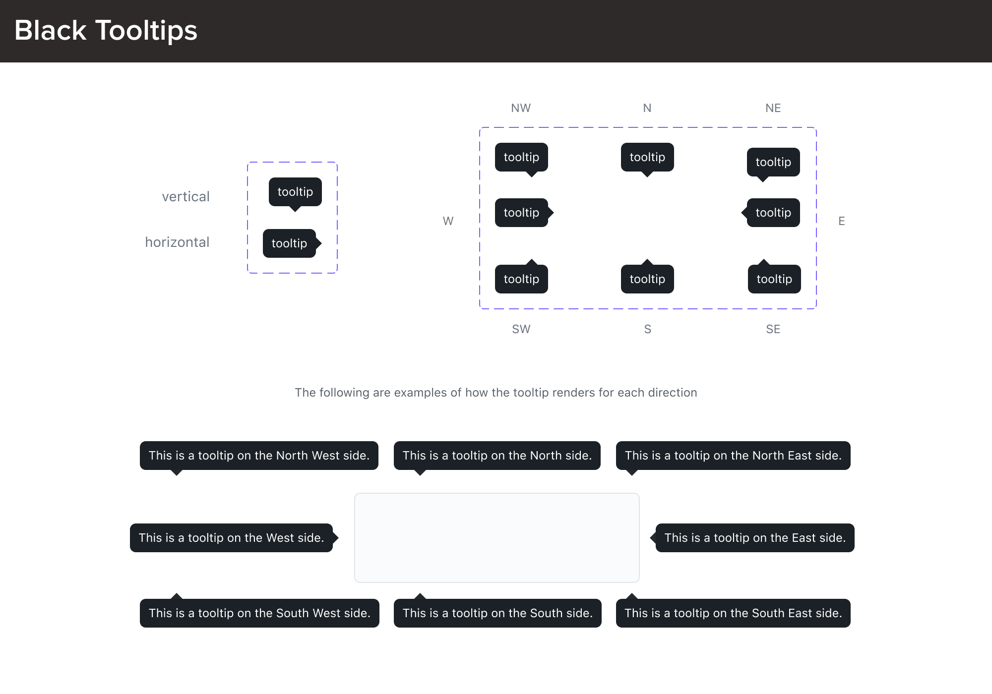
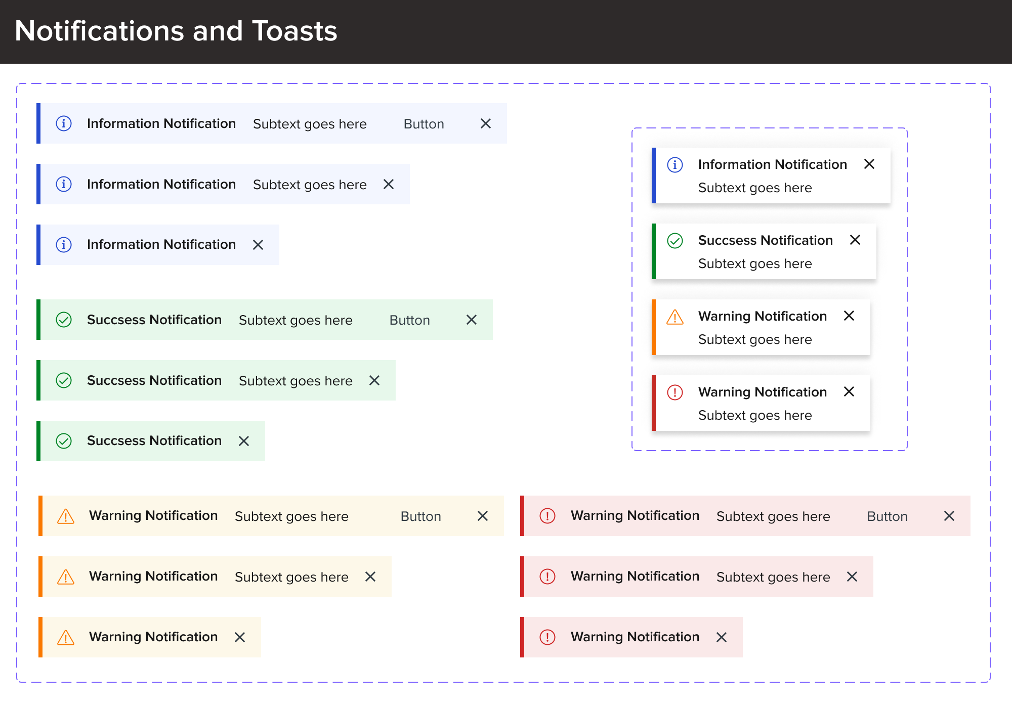
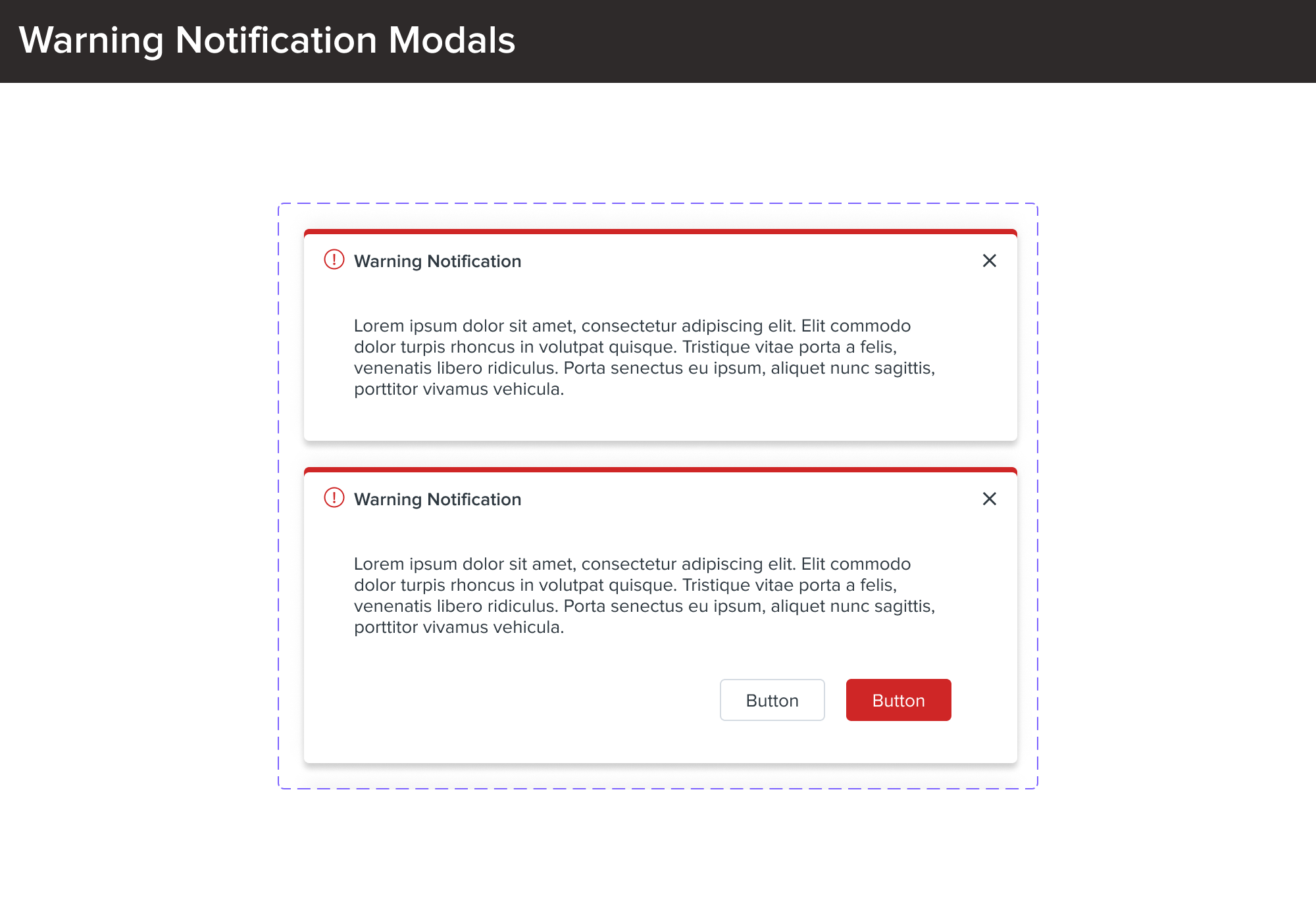
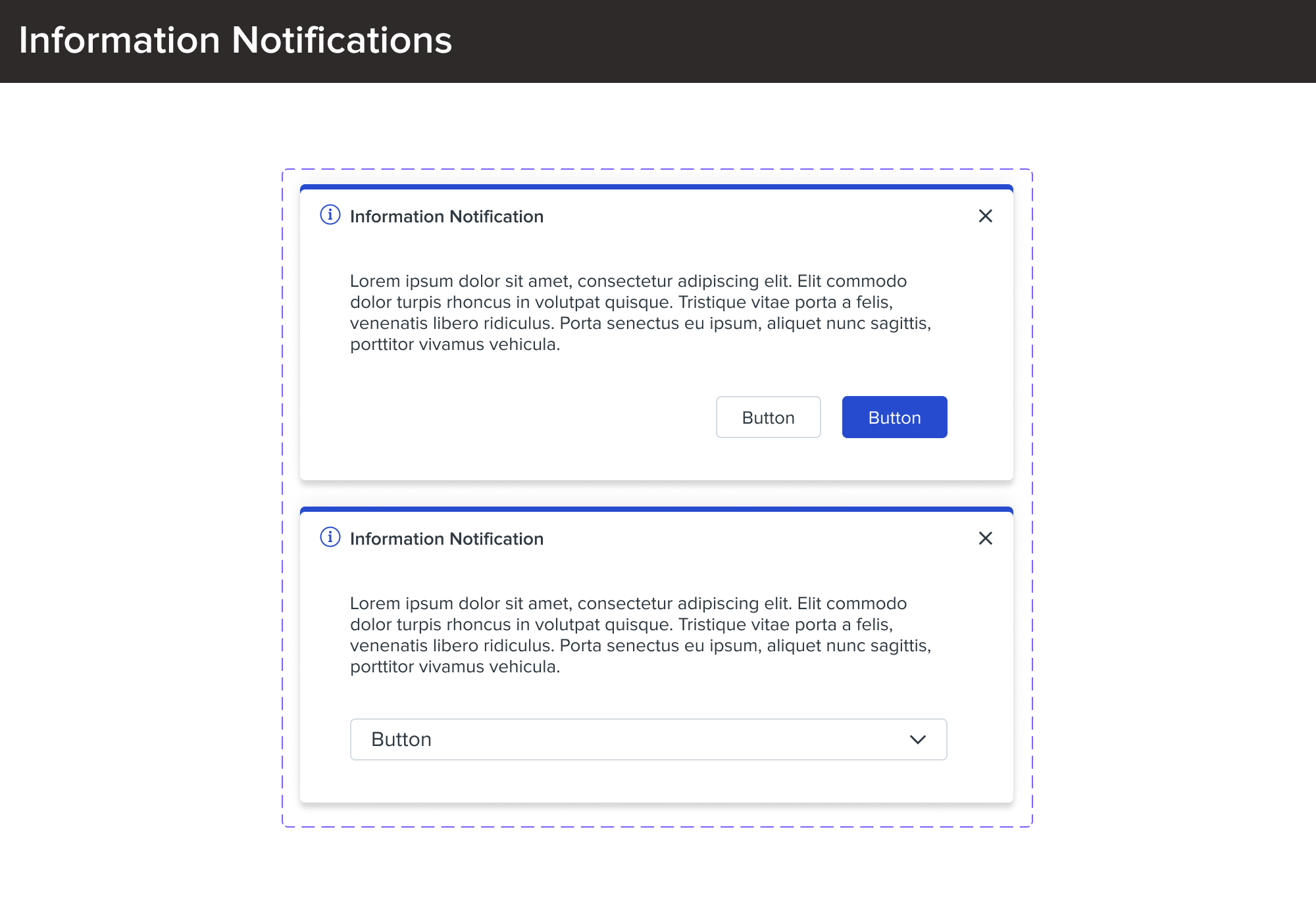
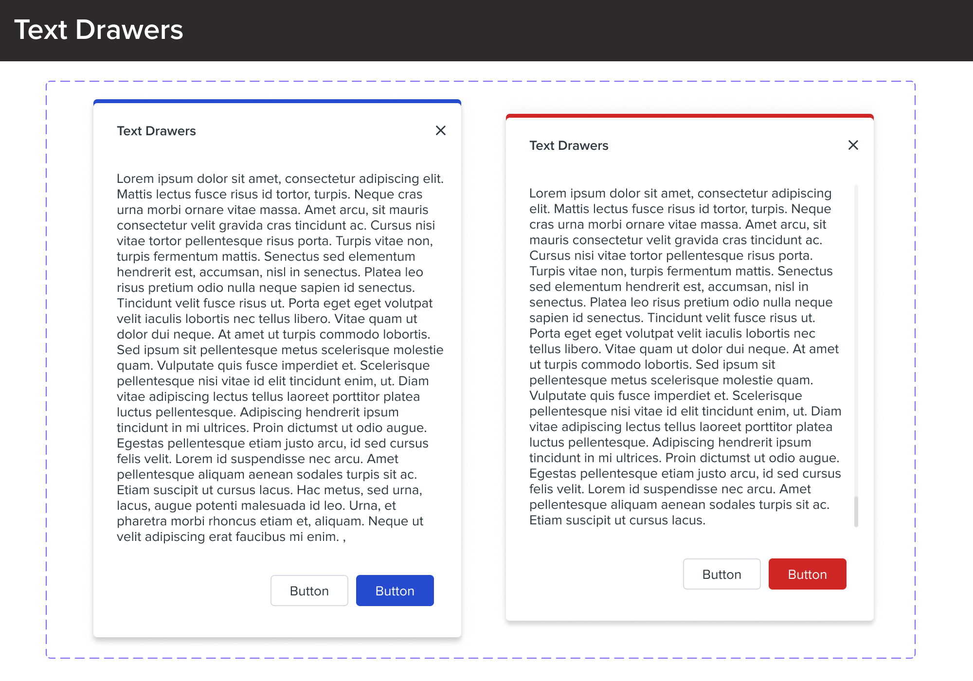
Phase 3: modals, selection descriptions, drawers, notifications, tooltips, popovers, color picker, tables, icon library, empty states, etc.
Phase 4: complex organism refinements, grid and layout template tweaking, finalized style guide, template and page designs, review by QA and devs, and showcase screens
Phase 5 (post-January 2022): alignment with other brands and teams to expand the design system, continuous iteration and tweaks, and final documentation
Here is what hundreds of Figma edits, design team meetings, and endless matcha lattes look like... Welcome to the Demandforce Design System!
Each of these phases contains atoms, molecules, and organisms that were tested multiple times by designers, QA, and developers in order to "break" and ensure that each component is thoroughly thought-out and accessible. Our designs are user-centered and uphold our design pillars, reflecting our brand identity while taking inspiration from other top companies.
Typography
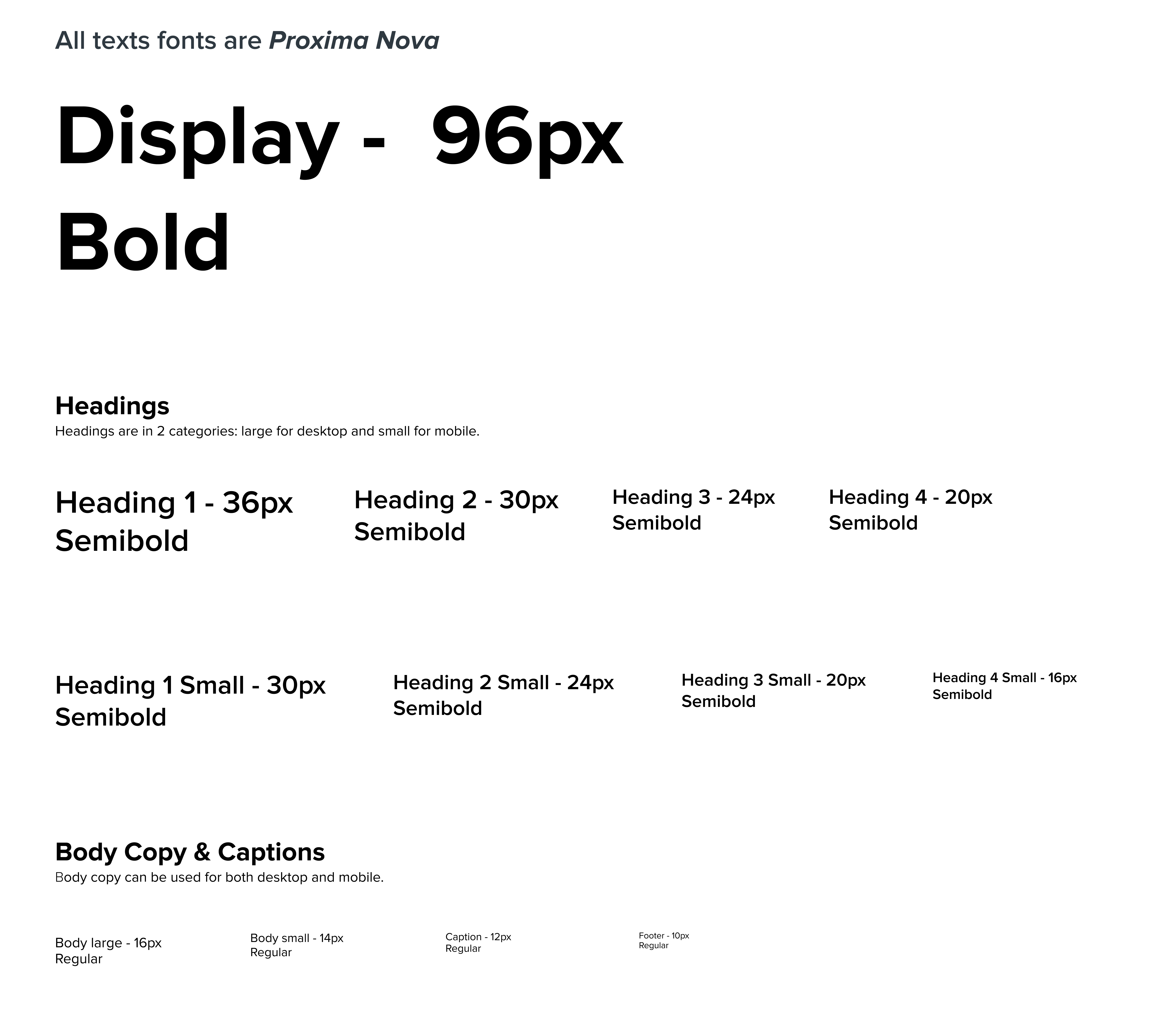
The typography system is an important part of the design system. It is used to establish our strong visual hierarchy and optimize readability. Creating consistency across experiences and platforms is an important part of the Demandforce design system.
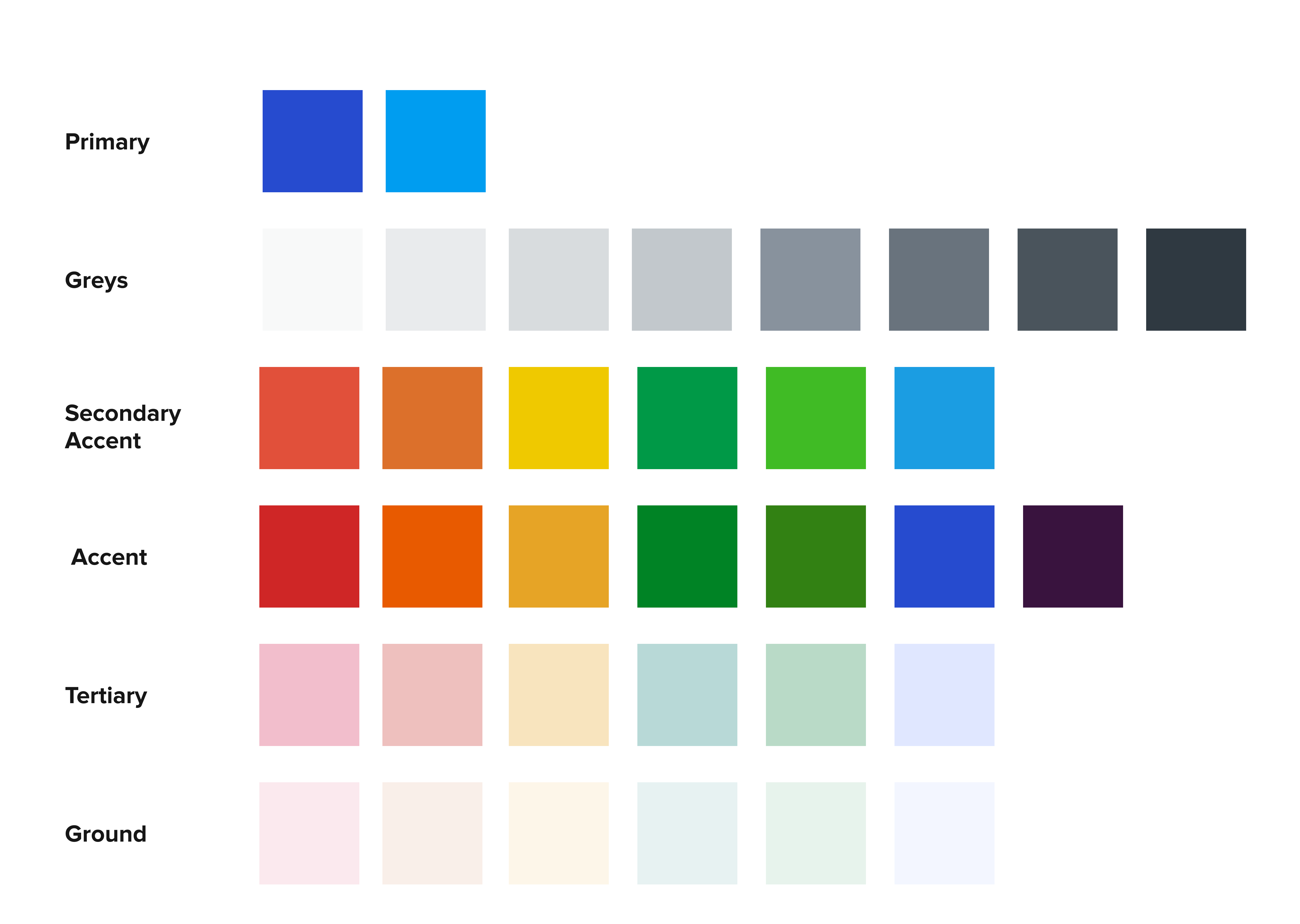
Color System
The Demandforce color system is accessible and inclusive. It brings consistency, scalability, and efficiency across all platforms and products. It unifies many products and allows for easy recognition throughout the system.
Component Library (Phases 1-4)
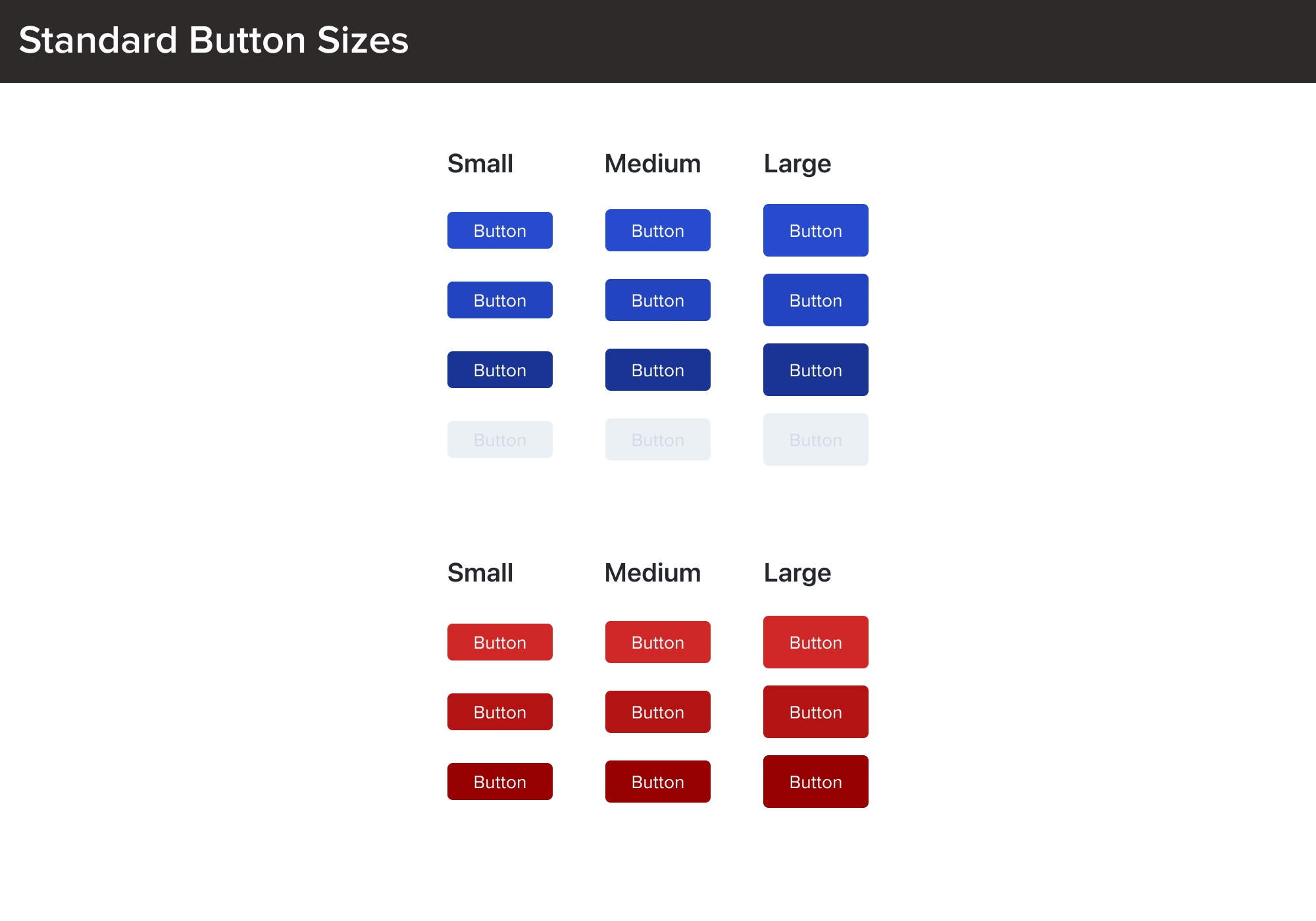
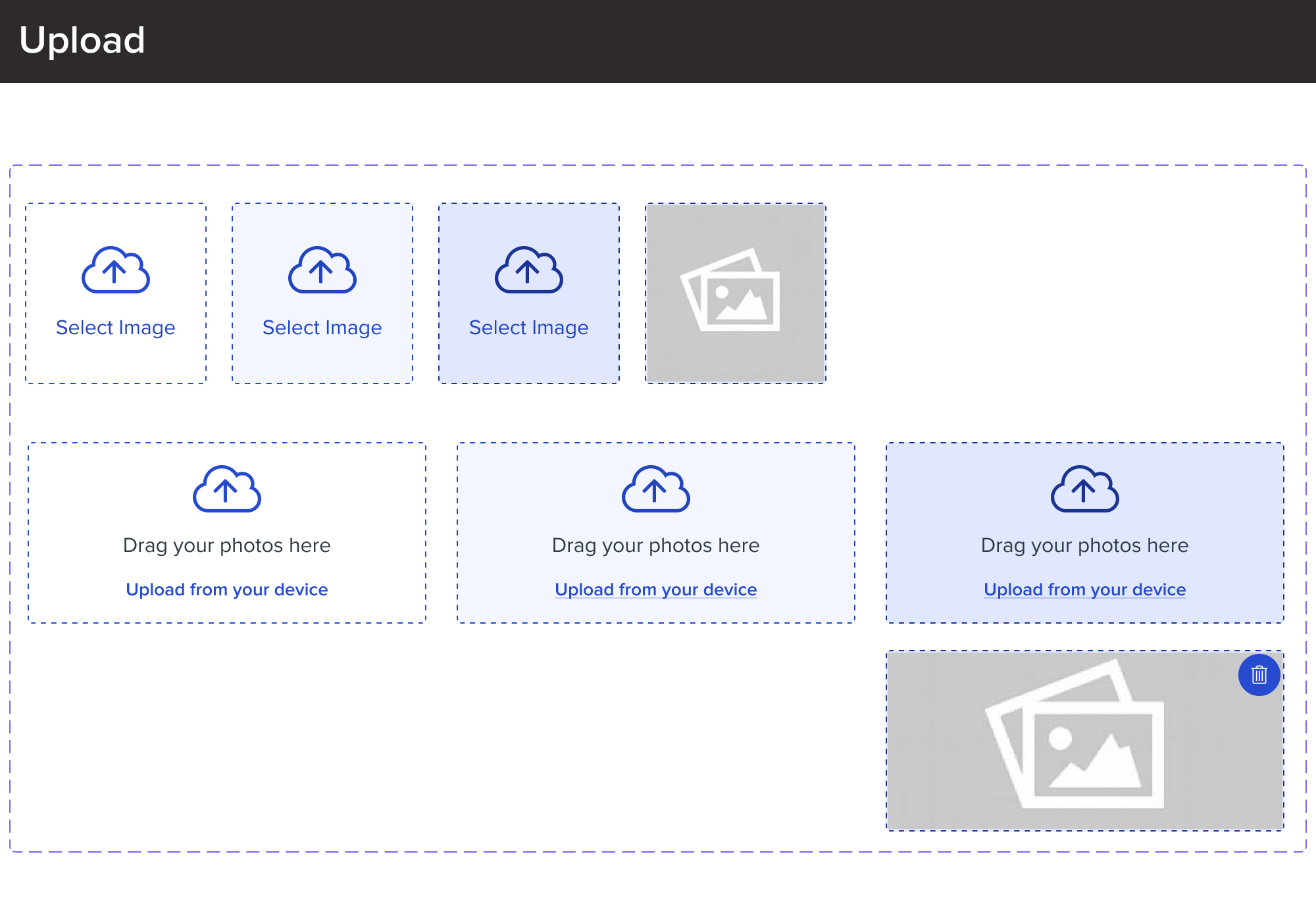
Here is a quick look into some of the many components made in each of the four phases. What can't be seen are the hundreds of iterations and adjustments made for each and every component in order to bring them to life. Oftentimes, phases blended together and required revisitation.
Phase 1
We began to build our design system with atoms and eventually, molecules. Component Anatomy and Spacing Rules were of utmost importance. Starting off small, we made multiple tweaks in our corner radii and states to create accessible and uniform components. All these were crucial as future changes would affect the building blocks of our design system — atoms.
Phase 2
Ensuring that atoms seamlessly come together to form molecules was the next step. As the design system grew, calendar pickers and navigational components began to crop up and challenge us to maintain consistent UI and interactions.
Phase 3
Organisms began to grow in number and seeing several molecules come together allowed us to address large text blocks and finalize shadows on modals and other floating components.
Phase 4
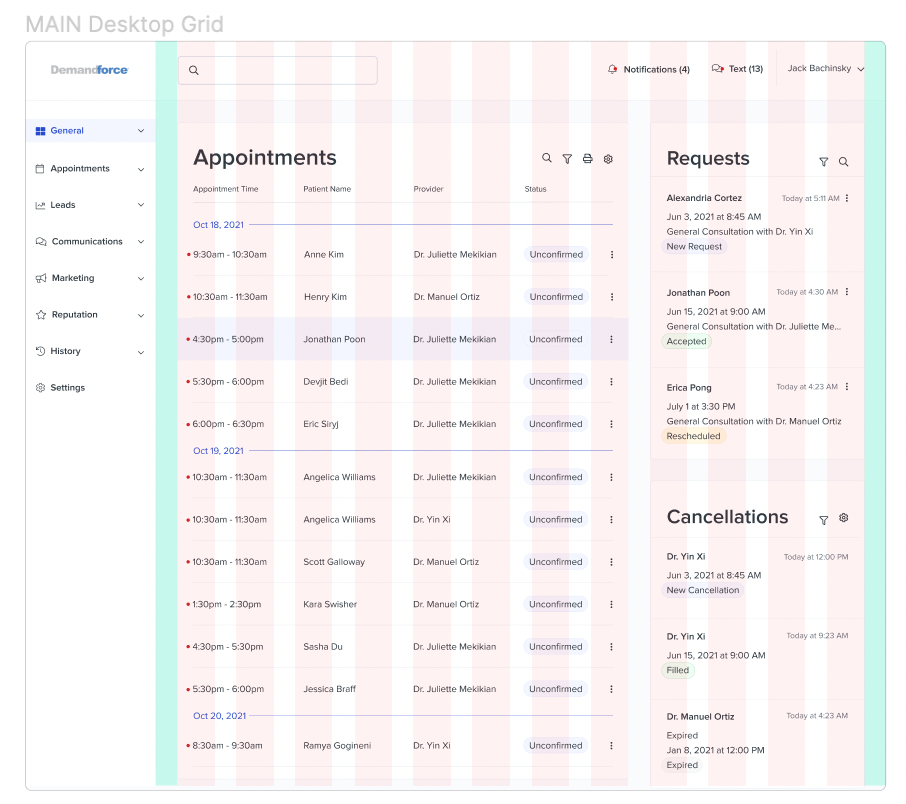
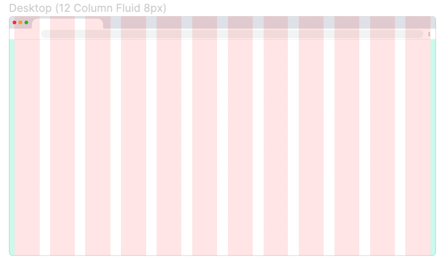
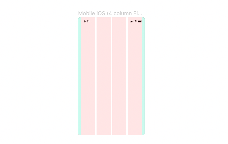
I finalized our grid and column layouts for mobile, tablet, desktop, and our dashboard. The presentation screens were built on these grids to keep all our work consistent and uniform in terms of spacing and layout.
05 Our users at the heart of every component
Components Complexity simplified.
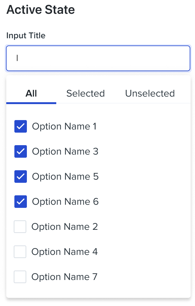
One of our most complex components was actually our multi-select dropdown menus. Our clients would regularly have 30+ options for patients to choose from or over a dozen rooms that different physicians would be in charge of. Therefore, we needed a way for our users to easily sort through selected and unselected options in our multi-select dropdowns. I drafted the solution and advocated for a tab-like filter at the top of the dropdown menu in order to easily filter results, while also keeping all 'selected' results at the top of the "all" view active.
06 Showcasing the Design System
Demandforce Gets a New Look
Ultimately, the design team presented the finished product to the whole Demandforce business with over 200+ people in attendance. It was the first time most of these individuals caught a glimpse of the product’s new design model. They were visibly impressed and expressed their excitement with “oohs” and “aahs”. The project was a huge success and was the best way to welcome our product into the New Year of 2022! Here's a sneak peek 😁
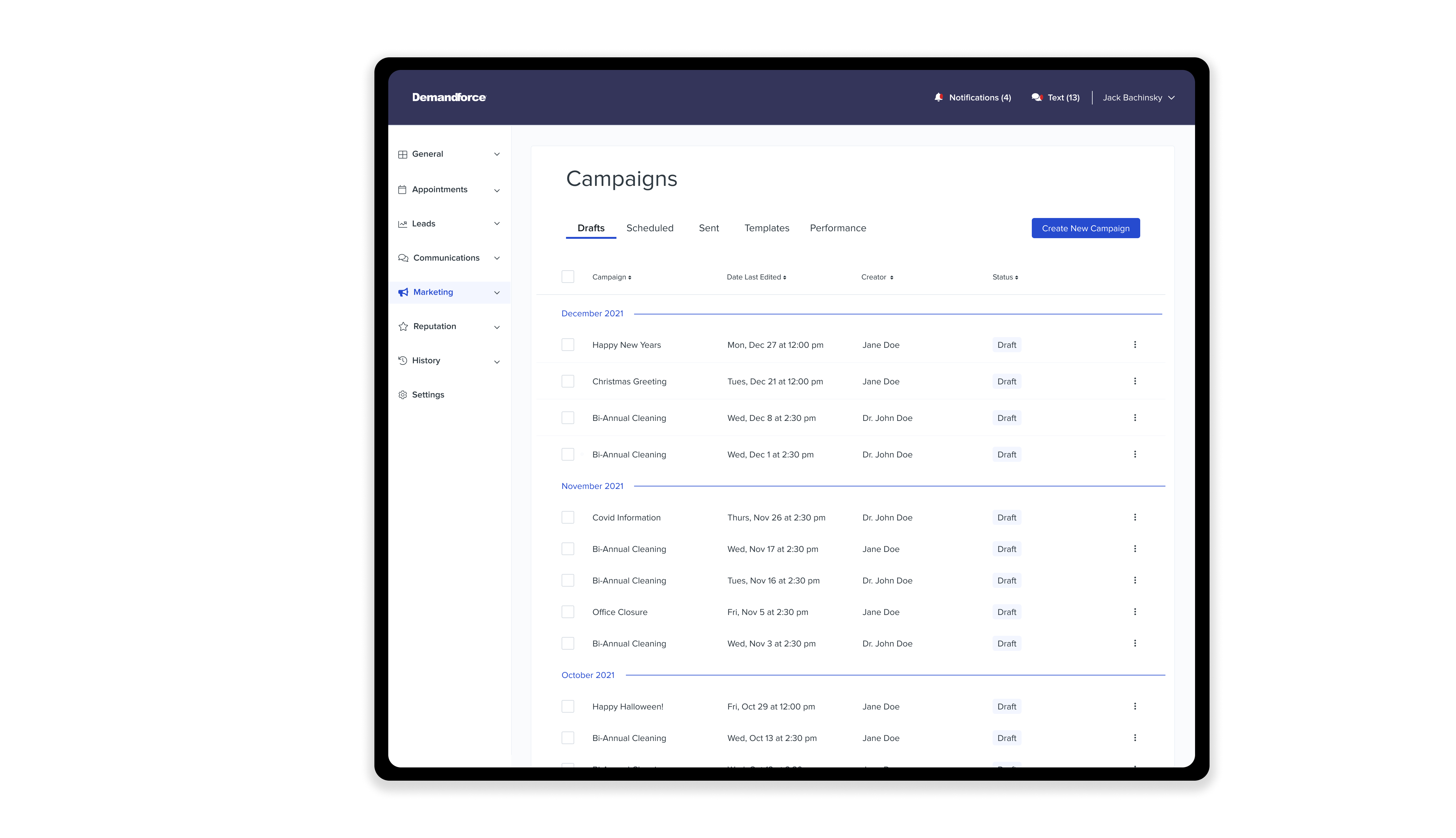
Campaigns Studio
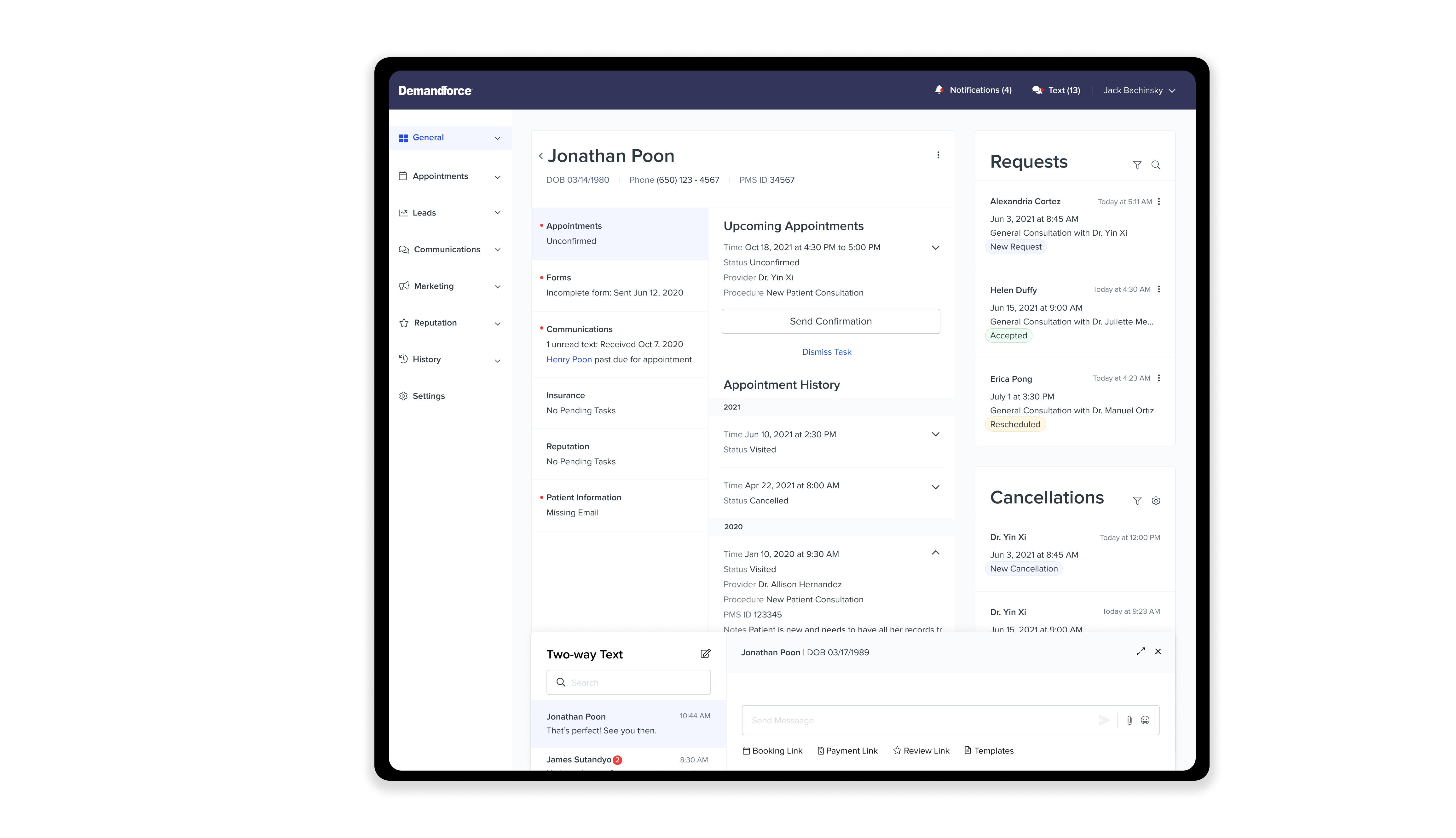
Dashboard Patient Details
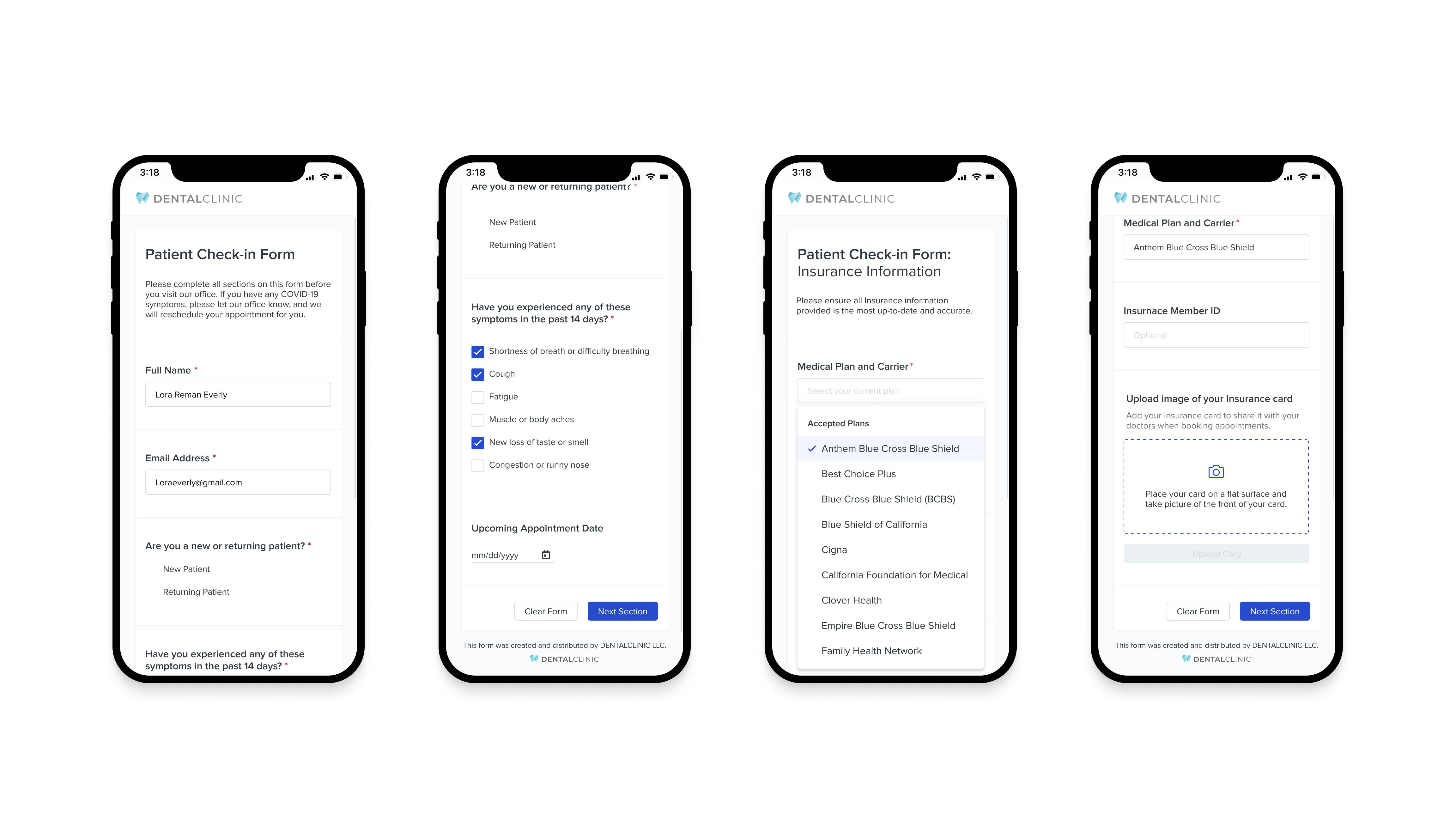
Patient Forms
The Impact
100%
1
100+
5 hrs
350+
Buy-in from all Demandforce Teams at the conclusion of the project
Complete and inclusive Design System built with the DF brand identity and IB design philosophy
Designers who will adopt the design system in the future
Amount of time saved per week with the new components, grids, and column layouts
Components and their variants that are ready to use for design in Figma
07 Where do we go from here?
Continuous iteration on current and new components
Aligning with sister brands to promote Design System adoption
Reskinning current DF features using the new Design System
Finalizing the documentation for each component
Sharing the Design System with all other designers at IB
Establishing a stable process for all Design System changes
A Brief Summary & Reflection
The Demandforce Design System creation process was a huge success! Although it is an evolving body of work, laying the foundation was an important undertaking for our team. Successfully delivering and showcasing the design system in January 2022 marked a great conclusion to the long process, but also jump started our goal to allow Internet Brand’s portfolio of brands to adopt the new Design System.
Working with three other designers was not only crucial, but informative. I gained fresh perspectives on various design styles in our numerous studio sessions. I had the remarkable opportunity to discover other companies' design systems and play a fundamental role in the whole design system creation process. My grit and adaptability allowed me to contribute during our intense decision making process of narrowing down our unique components. Gaining a better understanding of the building blocks and atomic design showcase the importance of Design Systems and proper usage of each component.
Since Demandforce and many other teams at IB used their own versions of a UI Kit, this was the perfect chance to educate individuals on the importance of UX and design and unite the company’s different teams. This process required feedback from individuals and tweaking the components for devs and QA gave me insights into people's workflows. The presentation to Demandforce was rewarding, as we realized how impactful our work truly was. There was no secret to our success — just hard work, collaboration, countless hours of research, a billion mouse clicks in Figma, and a common objective.
My key takeaway from this project is that creativity and collaboration are important ingredients to a successful design journey.
